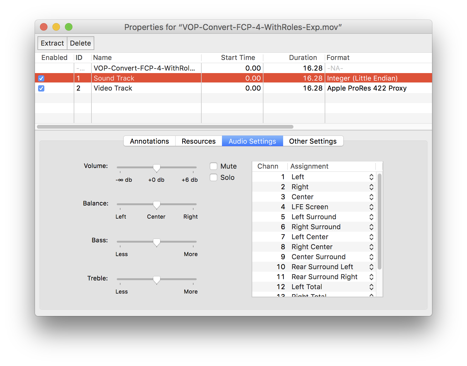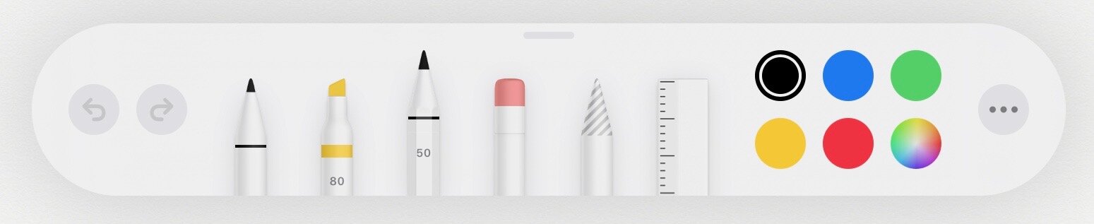
iOS 13 Notes Drawing Palette
Skeuomorphism at its worst. I mean, if you’re going to make a hyper-realistic tool palette, at least make the tools look something like they do in the real world. I actually thought they’d removed the pencil tool for the first 15 minutes of using this and I’m still routinely perplexed when selecting a tool. And that lasso tool? Seriously?
To be more specific in my criticism: the visual difference between the pencil tool and the pen tool is far too subtle; none of the real-world cues that communicate “pencil” — a yellow body, a gray tip, wood patterns, an uneven paint edge — are present.
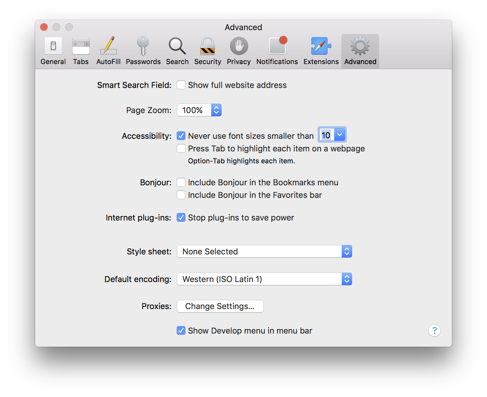
The tool palette from iOS 12 was much clearer, and with only a few simple lines and shapes.

iOS 12 Notes Drawing Palette